
A Guide to Flawless Aesthetic Website Design
- Paul Dorrian
- Jul 22, 2025
- 14 min read
A powerful aesthetic website design is so much more than a digital brochure. It’s a strategic business asset that instantly communicates who you are as a brand and builds immediate trust. For beauty and aesthetic brands, this visual first impression is everything—it directly shapes how potential clients see you and drives real results. It's the difference between a visitor who clicks away in seconds and one who becomes a loyal client.
Why Aesthetic Design Is Your Strongest Business Asset
In the fiercely competitive beauty and wellness market, your website is often the very first handshake with a potential client. This isn't just about looking pretty; it’s about creating a deliberate digital experience that feels professional, cohesive, and deeply trustworthy.
A well-executed design tells a story. It makes visitors feel a connection to your brand's values and vision before they’ve even read a word about your services. Honestly, this emotional connection is what separates the memorable brands from the forgettable ones.
This graphic really drives home how focusing on aesthetics and user experience delivers measurable improvements.
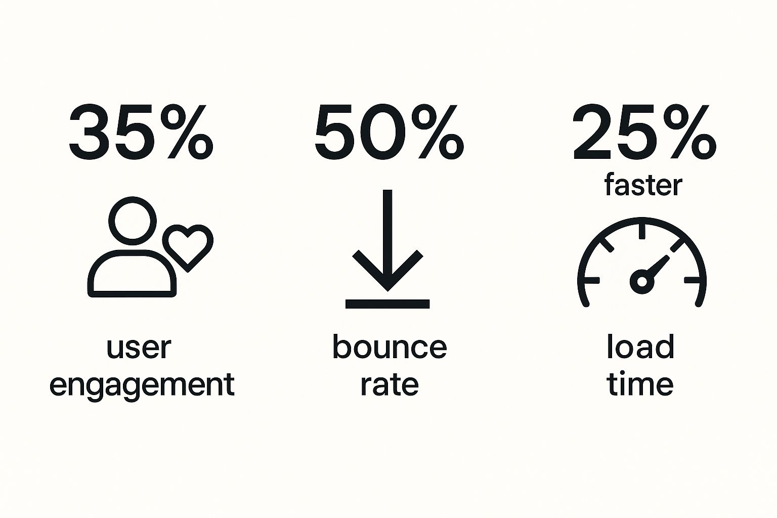
As you can see, a real commitment to quality design can dramatically increase engagement, slash bounce rates, and boost overall performance—all of which lead straight to a healthier bottom line.
The Financial Impact of Great Design
Thinking of design as a "nice-to-have" is a common but very costly mistake. The truth is, poor design carries a significant financial risk. In the UK, a staggering 75% of website visitors form opinions about a company's credibility based purely on its design.
With most people researching online before they buy anything, your website is a critical checkpoint. In fact, it's estimated that UK businesses lose 35% of potential revenue simply due to a poor user experience. On top of that, slow load times contribute to around £2.2 billion in lost sales each year. You can dive deeper into the data on how website design statistics impact UK businesses.
A strong, consistent brand identity paired with an intuitive and aesthetically pleasing website can increase a company's revenue by up to 23%. This isn't just a design choice; it's a core business decision.
From Credibility to Conversion
A brilliant aesthetic website design does more than just build credibility—it guides users effortlessly towards taking action. Put yourself in their shoes: a clean layout, clear navigation, and beautiful imagery make the journey from browsing to booking feel seamless and enjoyable. Every single element, from the font you choose to the colour palette, works in harmony to reinforce your brand's quality and professionalism.
To understand how these pieces fit together, let’s break down the core components of aesthetic design and see how they influence both user perception and your business goals.
Core Elements of Aesthetic Design and Their Business Impact
Design Element | Role in Aesthetics | Direct Business Impact |
|---|---|---|
Colour Palette | Evokes specific emotions and reinforces brand personality (e.g., calm, luxury, energy). | Creates brand recognition and influences purchasing decisions. |
Typography | Sets the tone and ensures readability. A clean font feels modern and professional. | Improves user experience, making content easier to consume and trust. |
Imagery & Video | High-quality visuals showcase results, build trust, and tell a compelling story. | Increases engagement and helps clients visualise their own transformation. |
Layout & Spacing | Creates a clean, uncluttered look that guides the user's eye naturally. | Reduces bounce rates by making information easy to find and digest. |
Navigation | An intuitive menu structure allows users to find what they need without frustration. | Directly impacts conversion rates by streamlining the user journey. |
Ultimately, a thoughtful combination of these elements is what transforms a simple website into a powerful business tool.
Unfortunately, many small businesses miss key opportunities. A surprising 70% of small UK businesses lack a clear call-to-action (CTA) on their homepage. This reveals a major disconnect between attracting visitors and actually converting them. An aesthetic design must also be functional, ensuring that CTAs are visible, compelling, and strategically placed. This is how you turn your beautifully designed website into your most effective sales tool.
Building Your Brand's Visual Foundation
Before a single line of code is written or a layout is mocked up, we need to lay the groundwork for your aesthetic website design. This is all about establishing a crystal-clear visual identity. It’s what ensures every button, image, and text block on your site feels cohesive, deliberate, and a true reflection of your brand.
I always start this process by creating a mood board. Honestly, it's the most effective way to translate your brand's abstract feeling into something tangible. You’re essentially building a visual compass for the entire project.
Start gathering images, colour swatches, textures, and font styles that truly capture the vibe you're aiming for. For example, a high-end skincare clinic might pull together photos of minimalist interiors, soft, natural lighting, and delicate botanical line drawings. A bold, modern makeup brand, on the other hand, would likely gravitate towards energetic cityscapes and vibrant, clashing patterns.
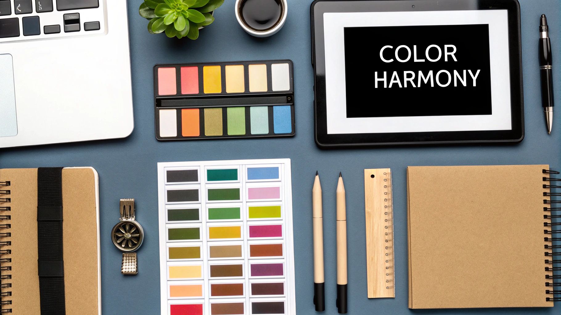
Defining Your Colour Palette
Colour isn't just decoration; it's psychology. The hues you select are the first thing that will communicate a feeling to your visitors, so getting this right is absolutely essential for setting the right tone.
Think about building a balanced and versatile palette. I typically advise clients to select:
A Primary Colour: This is your showstopper. It will be the most dominant colour on the site, used for big-impact areas like page headers and key call-to-action buttons. It needs to scream your brand.
A Secondary Colour: This is the supporting act. It should complement your primary colour beautifully, adding visual interest and highlighting secondary information without overwhelming the design.
An Accent Colour: Use this one sparingly but strategically. It’s your secret weapon for drawing the eye to the most important elements you simply can't let visitors miss, like a "Book Now" button or a limited-time offer.
Your colour palette is the emotional backdrop of your website. A well-chosen scheme doesn't just look good; it makes visitors feel something, building an instant connection to your brand.
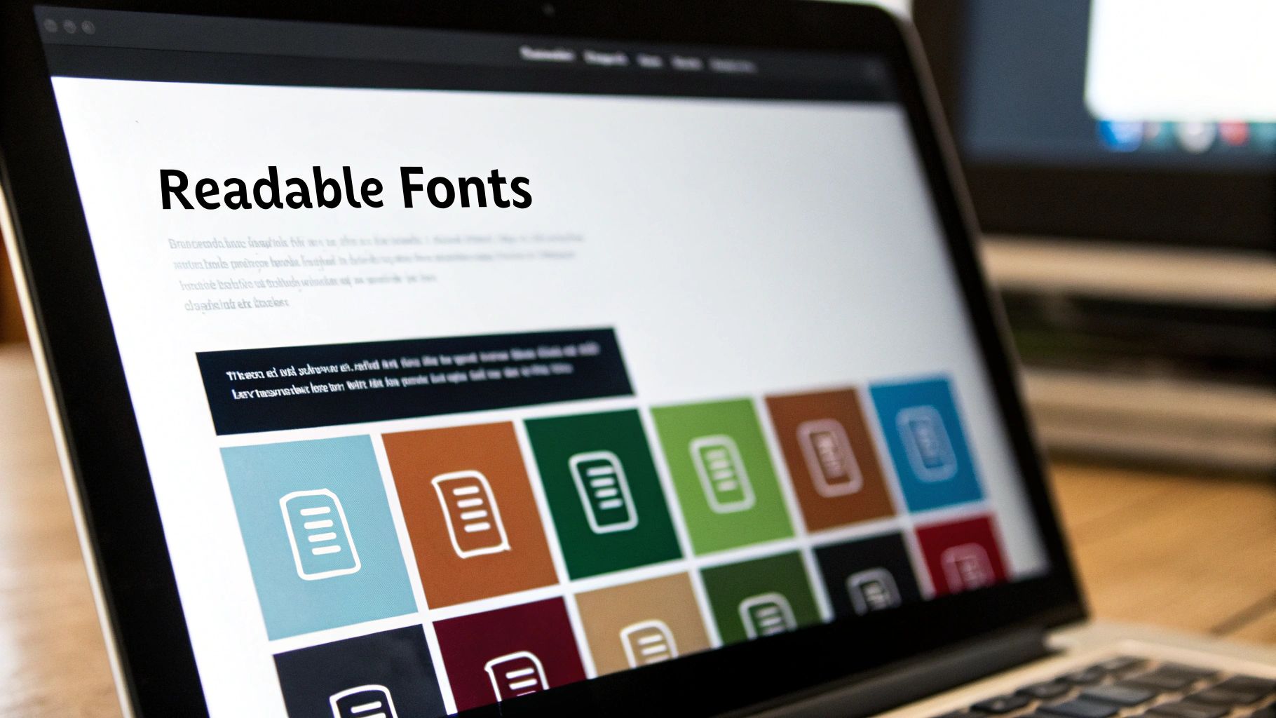
Choosing Your Typography
Just as impactful as your colours is your choice of typography. Every font has its own personality, and finding the right pairing is key to reinforcing your brand's character while ensuring everything is easy to read.
A classic serif font (the ones with little decorative feet on the letters) can feel elegant, established, and trustworthy—a perfect match for a medically-led aesthetic clinic. In contrast, a clean, crisp sans-serif font often feels more modern, approachable, and fresh, which could be ideal for a new beauty salon.
When you're settling on your fonts, keep these pointers in mind:
Readability is everything. It doesn't matter how stylish a font is; if your clients have to squint to read it, they'll simply leave. Always, always test your chosen fonts on both desktop and mobile screens.
Create a clear hierarchy. You need a distinct style for your main headings, subheadings, and body text. Using different font weights or styles guides the reader’s eye through the page and makes your content scannable.
Don't go overboard. A good rule of thumb is to stick to two, or at the absolute most, three complementary fonts. Any more than that and your website will start to feel chaotic and unprofessional.
Nailing this visual foundation is a critical part of the entire design process. For a deeper dive into this, you can explore our complete website design guide for beauty salons. Once your colours and fonts are locked in, you have a solid framework to build a truly stunning and effective website.
Designing a User-Focused Layout and Flow
A stunning design is only half the battle. If your visitors can't easily find what they’re looking for, even the most beautiful visuals won’t keep them around. Truly effective aesthetic website design is the sweet spot where gorgeous looks meet effortless function. Your real goal is to create a seamless journey that guides users from one page to the next, making their experience feel completely natural and intuitive.
This is where understanding user experience (UX) becomes non-negotiable. UX is all about shaping a digital path that feels logical and simple. I always tell my clients to think of their website like a high-end boutique: you'd expect clear aisles, beautifully displayed products, and an obvious route to the checkout. The same thinking applies to your online presence.
Harnessing Space and Hierarchy
Whitespace—that empty space around your text, images, and buttons—is one of the most underrated yet powerful tools in a designer's arsenal. It's not "wasted" space. On the contrary, it gives your content room to breathe, cuts down on visual clutter, and pulls the user’s eye towards the most important elements on the page.
Another core concept here is visual hierarchy. This is simply the art of arranging things on the page to show their order of importance. You can steer your visitor's attention using a few classic techniques:
Size: Bigger elements grab more attention. It’s why your main headline should always be larger than your subheadings.
Colour: A vibrant, contrasting colour for your "Book Now" button will make it pop against a subtle background.
Placement: We naturally assume things at the top of the page or in the centre are more important.
When you get space and hierarchy right, you create a layout that isn't just lovely to look at, but also incredibly easy for a visitor to scan and understand. For a deeper dive into these principles, have a look at our guide on 9 essential website design best practices for 2025.
From Wireframe to Reality
Before you even think about brand colours or fonts, you need to start with a wireframe. Think of it as a simple blueprint for your website—a basic sketch that maps out the structure and user flow without any distracting design elements. It's the architectural drawing for your digital space.
Taking this step forces you to think critically about the user's journey. From the homepage, where do you want them to click next? How will they find your treatment menu or book a consultation? A wireframe helps you answer these questions early on, saving you from frustrating and expensive redesigns down the line.
A 2025 survey of UK businesses found that 68% are planning to redesign or improve their websites in the next year. This highlights a growing realisation that a top-tier user experience is vital for staying competitive. You can see more insights in these UK digital marketing statistics and understand why your competitors are taking design so seriously.
Once you’re happy with the wireframe, the next step is a prototype. This is a more interactive, polished version that brings in visual details. It lets you test the entire user experience as if it were a live site, making sure every click and scroll feels right before you commit to the final build. It’s this thoughtful process that transforms a beautiful idea into a website that genuinely works for you and your clients.
Choosing and Implementing Your Visual Content
The visual content you select is the very heart of your aesthetic website. It’s the imagery and video that will truly showcase the quality of your work, connect with your target clients, and bring your brand identity to life. Every photo and graphic needs to be a deliberate choice, flowing seamlessly from the mood board and colour palette you've already pieced together.
So, where do you get these visuals? From my experience, there are really three paths you can take, each with its own pros and cons for a beauty business.
Sourcing Your Visuals
Stock Photography: This is often the most accessible starting point, especially if your budget is tight. Platforms like Unsplash have a wealth of high-quality, free images that can work well for background textures or more abstract brand concepts. The catch? They can look generic and won't feature your actual clinic, team, or the specific results of your treatments.
A Custom Photoshoot: Honestly, this is the gold standard. Investing in a professional photoshoot gives you a library of completely bespoke, high-resolution images. Nothing builds trust quite like showing off your beautiful clinic space, your friendly team, and your own clients' amazing results (with their permission, of course). It's a bigger upfront cost, but the payoff in brand authenticity is enormous.
Graphic Illustrations: For a truly unique and sophisticated feel, consider custom graphics and icons. These are fantastic for breaking down complex treatments or scientific concepts into simple, elegant visuals. This route ensures your website has a signature look that your competitors simply can't copy.
Getting Your Images Web-Ready
Once you have your visuals, the next step is non-negotiable: optimisation. A stunning image that takes forever to load is a major liability. Slow websites frustrate visitors and can send them clicking away before they've even had a chance to see what you offer. This directly impacts your ability to book new clients.
Your mission is to find the perfect balance between image quality and file size. A high-resolution photo straight from a professional camera can be several megabytes (MB) – far too hefty for a fast website. You need to compress every single image before you upload it.
Research shows that when a webpage’s loading time goes past just 3 seconds, the probability of a user leaving (the bounce rate) can shoot up by 38%. Think about that: nearly four out of every ten potential clients could abandon your site because of slow-loading images.
The good news is you don't need to be a tech wizard to handle this. There are plenty of online tools that can shrink your file sizes with almost no noticeable drop in quality. As a rule of thumb, I always aim to get key images under 200 kilobytes (KB). Taking this small step ensures your aesthetic website is not only beautiful but also blazing-fast for every visitor.
Adding a Touch of Movement
To take your site from a static page to a more dynamic experience, think about adding subtle animations or interactive elements. I'm not talking about flashy, distracting effects. Instead, consider elegant, almost unnoticeable touches.
Picture a gentle fade-in on text and images as a user scrolls down the page, or a button that subtly shifts in colour when you hover over it. These small details make the entire experience feel more polished and responsive, reinforcing the professional, high-end feel of your brand.
Bringing Your Aesthetic Design to Life
So, you’ve got your visual plan sorted. The mood board is perfect, the colours are decided, and you know exactly the feeling you want to evoke. Now for the exciting part: actually building the website. This is where your concept starts to feel real.
The very first big decision you'll make is choosing the platform to build on. This choice will shape everything that follows—from how much creative control you have to how easily you can sell products online. For most beauty and aesthetic brands, the decision usually boils down to a few excellent options.
Platforms like Squarespace and Shopify are fantastic if you want a beautiful, professional-looking site without getting tangled up in code. They come with stunning templates that you can adapt to fit your brand identity, and they take care of all the technical stuff like hosting and security. They're a brilliant way to get online quickly and effectively.
Then you have WordPress. It’s the powerhouse of the web for a reason. While there's a bit more of a learning curve, the customisation possibilities are endless. If you have a specific vision and want a truly bespoke aesthetic website design that no one else has, WordPress gives you that freedom.
Choosing the Right Platform for Your Brand
Picking the right tech is more than just a practical choice; it's a strategic one. If your platform and your business goals don't align, you’ll quickly run into roadblocks. Think about where you want your business to be in a few years and how comfortable you are with the technical side of things.
To help you decide, here’s a quick breakdown based on what we see with our clients:
Squarespace: This is the go-to for its beautiful, visually-driven templates. It’s perfect for service-based businesses like clinics or salons that need to showcase their work in a stunning portfolio and offer simple appointment booking.
Shopify: Without a doubt, the king of e-commerce. If you’re selling skincare, makeup, or any other physical products, Shopify's powerful inventory and sales features are absolutely essential.
WordPress: The most flexible choice by a long shot. With an enormous library of themes and plugins, you can create anything from a simple blog to a complex, feature-rich website. It just requires a bit more hands-on management.
No matter which one you go with, the mission is the same: to take everything from your mood board, colour palette, and font selections and translate it into a living, breathing website that truly captures the heart of your brand. It’s about methodically applying your style guide to every single element, from the navigation bar right down to the footer.
From Plan to Live Site
Once you've settled on a platform, it’s time to roll up your sleeves and start building. This is when you begin uploading your logo and images, setting your custom brand colours, and configuring your typography. It's an incredibly satisfying process to see all those carefully planned pieces finally click into place.
Interestingly, you're building your site at a time of subtle change in the design world. In 2025, the UK web design industry has seen a slight income dip of 0.8% annually, bringing it to around £640.6 million, largely due to post-pandemic economic adjustments. You can read more about the evolving economics of the UK web design market. But what this really means is that a high-quality, standout design is more critical than ever to cut through the noise.
Taking on a project of this scale can feel like a lot, especially when you’re also running a business. If you're feeling overwhelmed, don't forget that experts are here to help. Working with a specialist can ensure your website not only looks incredible but also works perfectly to attract and convert your dream clients.
You can learn more about how our custom aesthetic website services can bring your unique vision to life without any of the technical stress.
Your Top Aesthetic Website Design Questions Answered
Even with the most solid plan in place, a few questions are bound to pop up. It's completely normal. Getting these sorted early on can give you the confidence to push forward and keep your aesthetic website design project running smoothly. Let's dig into some of the questions we get asked most often.
What’s the Real Cost of Building an Aesthetic Website?
Ah, the million-dollar question. Or, hopefully, a bit less! The truth is, there's no one-size-fits-all price. You could be looking at anything from a few hundred pounds for a simple DIY site on a platform like Squarespace to many thousands for a completely bespoke agency build.
What really drives the cost? It boils down to a few things:
Your Chosen Platform: A user-friendly builder is often more budget-friendly upfront than a highly customised WordPress site, which might need a developer's touch.
The Degree of Customisation: Sticking close to a pre-made template will keep costs down. If you want a design built from the ground up with unique features, that’s where the investment grows.
Creating Your Assets: Don't forget to factor in the cost of a professional photoshoot, custom graphics, or polished copywriting if you're not handling those yourself.
How Long Until My New Website Is Live?
This is another classic "how long is a piece of string?" question, but I can give you some realistic timeframes. A straightforward, template-based website can often be turned around in as little as two to four weeks, but that's a big if—it assumes you have all your content and images ready from the get-go.
For a more complex, custom-built site, you're usually looking at a timeline of eight to twelve weeks, sometimes longer. This all depends on the number of pages, the intricacy of features like e-commerce or booking systems, and how much back-and-forth is needed for feedback and tweaks. Honestly, the biggest bottleneck I see is waiting for client content. Having your text and photos prepared is the single best thing you can do to speed things up.
If there's one thing to remember, it's that good design takes time. Rushing it almost always means cutting corners on quality and user experience, which will likely cost you more down the road in lost business or a premature redesign.
Is a Blog Really Necessary for My Aesthetics Brand?
For anyone in the beauty and aesthetics space, my answer is almost always a firm yes. A blog isn't just for company updates; it’s one of your most powerful tools for Search Engine Optimisation (SEO).
Every single post you publish is a new chance to show up in Google when potential clients search for terms like "best facials for acne" or "microneedling aftercare".
More than that, it's how you build trust and establish yourself as an expert. By providing genuinely helpful, educational content, you position your brand as a credible authority. It helps potential clients feel they're in safe hands, making them much more likely to book with you. Think of it as your dedicated space to prove you know your stuff and connect with your audience.
Feeling inspired to create a website that not only looks incredible but also works hard to bring in your ideal clients? The team at Aesthetic Socials lives and breathes this stuff, crafting bespoke websites specifically for beauty and aesthetic professionals. Let's build your brand's beautiful online home together.
Article created using [Outrank](https://outrank.so)


Comments