
Aesthetics Web Design That Converts
- Paul Dorrian
- Jul 23, 2025
- 15 min read
In the beauty and cosmetic treatment industry, aesthetics web design is much more than just creating a pretty online space. It’s the skillful blend of art and psychology, focused on building a digital presence that reflects the same precision, care, and quality you offer in your clinic.
Your Website Is Your Digital Front Door
Think of your website as the very first impression your aesthetics clinic makes. Long before a potential client ever steps through your doors to experience your beautifully curated space, they’ll meet you online. This initial digital handshake isn't just a casual click; it's the start of a relationship, one that needs to be built on trust and a sense of your expertise.
Your website is, for all intents and purposes, the digital version of your clinic's reception area. Does it feel clean, welcoming, and professional? Or is it cluttered, outdated, and difficult to navigate? Every single element, from your chosen colour palette to the exact placement of a "Book Now" button, has a job to do. It guides a visitor's experience and shapes their opinion of your brand. A seamless, elegant website subconsciously promises that your treatments will be just as meticulous and professional.
The Psychology of First Impressions
The power of that first impression can’t be overstated, and online, it happens in a flash. Research consistently shows that a website's design is responsible for a staggering 94% of a user's initial judgement, making it the absolute foundation for building trust.
What’s more, a bad design isn't just a minor turn-off. Around 38% of visitors will click away if they find a website’s layout or content unattractive. This statistic really drives home the real-world cost of overlooking aesthetic quality, especially in such a competitive field. You can dive deeper into these web design statistics to grasp their full impact.
This is where thoughtful aesthetics web design proves its worth. It’s not about decoration; it’s a strategic business tool that marries artistry with a keen understanding of user psychology. The real goal is to create an online environment that feels both aspirational and approachable—sophisticated, but still incredibly simple to use.
A well-crafted website does more than just list your services. It communicates your brand's core values, builds instant credibility, and gives potential clients the confidence they need to choose you. It's your hardest-working, 24/7 brand ambassador.
From Browser to Loyal Client
At the end of the day, the goal of brilliant aesthetics web design is to turn curious browsers into loyal, long-term clients. This guide will walk you through the core principles that make that happen. We'll explore exactly how to:
Establish Visual Harmony: Learn how balance, contrast, and white space create a calm and professional atmosphere online.
Leverage Colour and Typography: Discover which palettes and font pairings evoke feelings of trust, serenity, and medical precision.
Design for Conversion: Understand how to use strategic layouts and authentic imagery to gently guide users toward booking a consultation.
By mastering these elements, you can ensure your digital front door is every bit as polished and inviting as your physical one, paving the way for genuine business growth and lasting client relationships.
The Blueprint for Visual Harmony and Trust
Think of great web design like a beautifully composed piece of music. Every note, every pause, and every instrument has its place, all working together to create a feeling of harmony. In the same way, your website uses core design principles—balance, contrast, and repetition—to build a sense of order and professionalism that instantly puts visitors at ease.
These aren't just arty suggestions; they are the bedrock of effective visual communication. When you get them right, a potential client’s eye moves effortlessly across the page. It prevents visual chaos and subconsciously tells them your clinic is credible and pays attention to the details. An unbalanced or messy design, on the other hand, just feels off, creating a sense of unease and distrust.
Finding Balance in Your Layout
At its heart, balance is about distributing the visual weight on your page. Picture your webpage as an old-fashioned set of scales. To keep it stable, you need to arrange your elements—images, text blocks, call-to-action buttons—so that one side doesn't feel like it’s about to tip over. This creates an immediate feeling of stability and calm for the user.
You can achieve this in two main ways:
Symmetrical Balance: This is when elements are mirrored on either side of a central line. It creates a feeling of formality, order, and trustworthiness. You’ll often see high-end brands use symmetry to convey a sense of classic luxury.
Asymmetrical Balance: This is a bit more creative. It involves arranging elements of different visual "weights" to still feel balanced. For example, you could balance one large, dramatic image with several smaller blocks of text and a button on the other side. This approach feels more dynamic, modern, and engaging.
The choice between them really depends on the personality of your clinic. Are you classic and serene, or modern and energetic? Getting the balance right helps reinforce that message from the first glance.
The goal of a balanced design is to ensure no single part of the page overwhelms the others. It provides a stable foundation, making it easier for visitors to absorb your key messages without feeling visually disoriented.
The Strategic Use of White Space
One of the most powerful—and often overlooked—tools for creating harmony is white space. This is simply the empty area around and between your design elements. Far from being "wasted" space, it's an active and essential part of any clean, sophisticated design.
Think of white space as the breathing room for your content. It’s like the spotlight on a stage, focusing attention exactly where you want it: on your stunning 'before and after' gallery or your "Book a Consultation" button. A cluttered page with hardly any white space feels overwhelming and, frankly, a bit cheap.
Good use of white space:
Improves Readability: It makes paragraphs and sentences much easier to scan and digest.
Creates Focus: It naturally guides the user's eye towards your most important calls-to-action.
Signals Luxury: It communicates a premium, uncluttered, and high-end feel.
By embracing a bit of emptiness, you give your content the room it needs to shine. We explore how these foundational rules work together in our comprehensive [guide to flawless aesthetic website design](https://www.aestheticsocials.co.uk/post/a-guide-to-flawless-aesthetic-website-design).
Creating Contrast and Repetition
Contrast is what makes certain elements pop. You create it by placing things that are visually different next to each other—like a bold, heavy headline against light, simple body text, or a brightly coloured button on a muted background. Contrast builds a clear visual hierarchy, telling the user what to look at first.
Repetition, on the other hand, is all about consistency. When you use the same font styles, colour palettes, and button designs throughout your site, you create a cohesive and predictable experience. This constant reinforcement of your brand identity makes your site feel intuitive and effortless to navigate.
Together, these principles are the blueprint for a website that doesn't just look beautiful. They help it function as a powerful tool for building trust, turning your digital space from a brochure into an experience that truly reflects the quality and care of your clinic.
Using Colour and Typography to Build Your Brand
Your brand's digital presence hinges on two core elements: colour and typography. Don't mistake them for mere decoration. They are powerful tools that, when used correctly, speak directly to your visitors, shaping their perceptions and emotional responses long before they read a single word. For an aesthetics clinic, where you’re building feelings of trust, care, and precision, getting these right isn't just important—it’s everything.
Think of colour as the unspoken language of your website. It sets the mood, hints at your brand's personality, and can even guide a potential client's actions. A well-chosen colour scheme is an emotional shortcut, instantly telling visitors what to expect from your clinic.
Choosing Your Brand Colours
The psychology of colour isn't just a fascinating theory; for aesthetics clinics, it's a practical business tool. Your palette should be a direct reflection of the experience you promise. Are you a serene, spa-like sanctuary or a high-tech, clinical facility? Your colours should make that distinction crystal clear from the moment the page loads.
To help you get started, here's a look at how different colour palettes can define your brand's identity and attract the right clients.
Choosing Brand Colours for Your Aesthetics Clinic
A guide to selecting a colour palette that reflects your brand's identity and resonates with your target clients in the beauty industry.
Color | Associated Feelings | Best For Aesthetics Clinics That Are |
|---|---|---|
Soft Pastels (Pinks, Peaches, Muted Greens) | Calm, serenity, gentle care, nurturing | Focussed on holistic wellness, relaxing facials, and a soothing client experience. |
Clean Blues & Whites | Medical precision, cleanliness, trust, expertise | Specialising in injectables, laser treatments, or other advanced clinical procedures. |
Monochromatic (Shades of Grey, Black, White) | Sophistication, luxury, modern, exclusive | Premium, high-end brands targeting a discerning clientele who expect the very best. |
Earthy Tones (Beige, Taupe, Sage) | Natural, grounded, organic, healthy | Emphasising natural-looking results, using organic products, or focusing on skin health. |
Once you've found a palette that feels right, the key is consistency. These colours need to appear everywhere—from your call-to-action buttons to your image overlays—to create a unified and undeniably professional brand experience.
The Art of Typography
If colour sets the mood, then typography gives your brand its voice. The fonts you select determine whether your brand sounds elegant and classic or clean and modern. But great typography is about more than just picking a font you like; it’s about creating a clear visual hierarchy that makes your content effortless to read and understand.
Good typography is invisible. It lets the reader focus on the message, not the letters. Bad typography, on the other hand, is all you can see.
The secret to strong web typography is all in the pairing. You’ll generally need two fonts that work together: one for your headings and another for your main body text.
Heading Font: This is your chance to show some personality. An elegant serif font (like Playfair Display) can convey luxury, while a clean sans-serif (like Montserrat) feels direct and modern.
Body Font: Readability is your #1 priority here. Choose a simple, clean font that’s easy on the eyes, especially for longer paragraphs on a screen.
The space around your text is just as important as the text itself. This image shows just how much whitespace can affect user engagement.
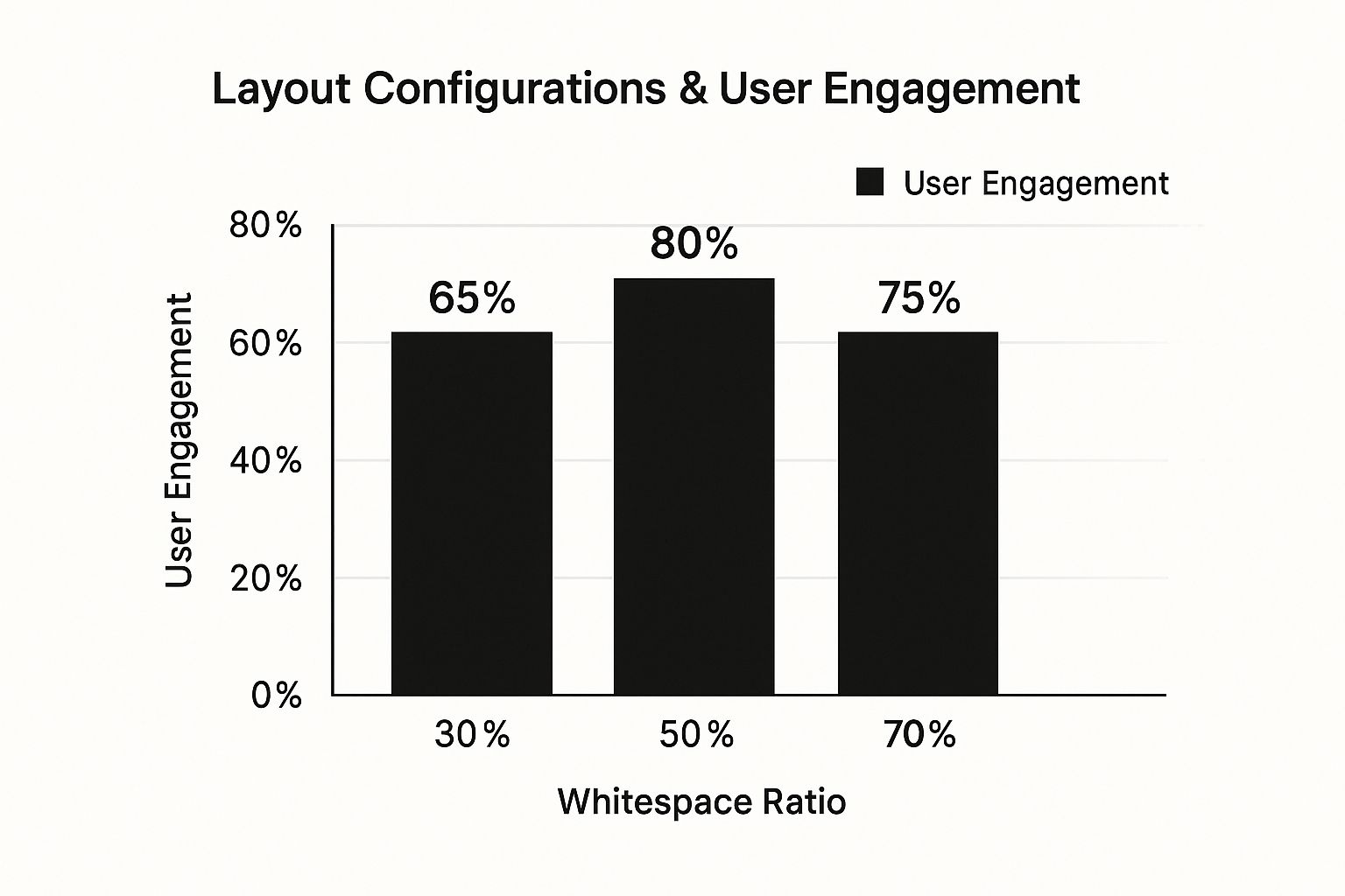
As you can see, finding that sweet spot is crucial. Too little space feels cluttered and overwhelming, but too much can make your site feel empty and disconnected.
Beyond just choosing your fonts, zoom in on the details. Make sure your body text is a comfortable size (usually around 16-18px) and that you give your lines enough room to breathe with proper line spacing. These small tweaks can transform a daunting wall of text into content that’s inviting and easy to read.
This level of detail is something we explore further in our complete guide on [website design for beauty salons](https://www.aestheticsocials.co.uk/post/website-design-for-beauty-salons-your-essential-guide). By combining a thoughtful colour palette with strategic typography, you start building a powerful brand identity that connects with your ideal client from the very first click.
Creating Layouts and Imagery That Convert
While your colour palette and typography give your website its soul, the layout and imagery provide its structure and substance. This is where a beautiful design becomes a high-performing booking machine. It’s all about strategically guiding your visitor's eye, building trust, and encouraging them to take that next step.
Think of your homepage as a well-designed map. A good map doesn't just show the terrain; it highlights the most important landmarks and gives you a clear path to your destination. In the same way, an effective website layout directs visitors effortlessly toward your key information and, ultimately, your "Book Now" button.
This isn’t about guesswork. It’s about understanding how people naturally scan web pages. By aligning your design with these predictable behaviours, you can place your most compelling content exactly where it will have the greatest impact. You can turn passive browsing into active engagement.
Designing for Natural Reading Patterns
When someone lands on a new website, they don't read every single word. Instead, they scan for keywords and points of interest in predictable patterns. Two of the most common are the F-Pattern and the Z-Pattern.
F-Pattern: You’ll see this on text-heavy pages like blog posts or detailed service descriptions. A person’s eyes move across the top of the page (forming the top bar of the 'F'), then they drop down slightly and read across in a shorter second line (the lower bar of the 'F'). Finally, they scan down the left side of the page.
How to Use It: Place your most critical information, like your main headline and key benefits, across the top. Your call-to-action or contact details should be easy to find along that left-hand vertical line they're scanning.
Z-Pattern: This pattern applies to simpler, less text-heavy pages—like your homepage. The eye moves from top-left to top-right, then cuts diagonally down to the bottom-left, and finally shoots across to the bottom-right. It’s a natural flow for a clean design.
How to Use It: This layout is perfect for aesthetics websites. Put your logo in the top-left, your main menu in the top-right, your core value proposition along that diagonal path, and your primary call-to-action (like "Book a Consultation") in the bottom-right corner. It just works.
By understanding these simple patterns, you create a visual journey that feels intuitive and guides clients without them even realising it.
The Power of Authentic Imagery
In the aesthetics industry, trust is everything. Your choice of imagery is one of the most powerful tools you have for building that trust. Potential clients want to see real results and the real people behind your brand, not smiling models from a stock photo library.
Generic stock photos feel impersonal and can even break trust. Your greatest visual assets are authentic, high-quality images of your actual clinic, your team, and your clients. They prove your expertise and make your brand feel genuine and approachable.
For your aesthetics website, make these types of images a priority:
High-Quality Before and After Photos: These are your most compelling proof points. Just make sure they are well-lit, consistent, and presented professionally.
Your Clinic Environment: Show off your clean, modern, and welcoming space. This helps potential clients feel comfortable before they even step through the door.
Photos of Your Team: Putting a face to the name builds a personal connection and highlights the professionalism of your practitioners.
Don’t forget to optimise your images for the web. Large, uncompressed files can drastically slow down your site's loading speed, which can make your clinic seem unprofessional and will definitely frustrate visitors. A fast, responsive site is a non-negotiable part of a great user experience. For more on this, you can review our [9 essential website design best practices for 2025](https://www.aestheticsocials.co.uk/post/9-essential-website-design-best-practices-for-2025).
Elevating the Experience with Motion
Subtle animations and video can lift your website from a static brochure to a dynamic, premium experience. Think about adding embedded video testimonials, where clients share their positive experiences in their own words. It's far more powerful than a written quote.
The UK's web design market is constantly evolving, with many clinics making smart choices about how they create these digital experiences. Interestingly, about 42% of web design tasks are managed by in-house teams, while the rest are outsourced to agencies or freelancers. This is partly driven by new tech; nearly 93% of designers now use AI tools to help create compelling media and imagery. By combining strategic layouts with authentic, optimised visuals, your site will do more than just look good—it will convert visitors into loyal clients.
Maintaining a Cohesive Brand Experience
Having a beautiful website is a fantastic start, but it's only one piece of the puzzle. For your clinic's brand to really connect with people, the look and feel of your aesthetics web design need to flow through every single place a client might interact with you. This consistency is what turns a business into a brand people remember and trust.
Think of it as your clinic's 'brand uniform'. Your team likely presents a unified, professional image in person, and your digital presence should do exactly the same. That elegant colour scheme, the sophisticated fonts, and the clean logo on your website? They need to show up on your Instagram grid, in your email newsletters, and even on your physical business cards and brochures.
This isn't about being repetitive; it's about building recognition. When a potential client sees the same visual cues across different platforms, it creates a powerful sense of familiarity and reliability. This cohesion screams professionalism and makes your clinic feel established—a crucial factor when someone is deciding where to go for aesthetic treatments.
Building Your Brand Style Guide
So, how do you make sure this consistency isn't just a happy accident? The best way is to create a brand style guide. This doesn't have to be some massive, complex document. At its heart, it's a simple rulebook that outlines how to use your brand's visual elements correctly.
For an aesthetics clinic, a basic style guide should cover:
Logo Usage: Show your main logo and any secondary versions (like an initial-based icon). You’ll want to specify clear rules on spacing around it, the minimum size it can be, and how it should look on light versus dark backgrounds.
Colour Palette: List your primary and secondary brand colours with their exact colour codes (like HEX or RGB). This is how you ensure your signature blush pink or clinical blue is always the exact same shade, every single time.
Typography: Define which font is for headings and which is for body text. Specify the weights (e.g., Bold, Regular) and sizes to use, creating a clear visual hierarchy that you can replicate everywhere.
A brand style guide is your single source of truth for your visual identity. It empowers you, your team, or any marketing partner to create materials that are always perfectly on-brand, strengthening recognition and trust at every turn.
The Impact of a Unified Experience
When every digital and physical touchpoint tells the same visual story, the payoff is huge. A potential client might find you through an Instagram post, click over to your website to learn about a treatment, and then get a follow-up email from you. If the look and feel are identical across that entire journey, the experience feels seamless and deeply reassuring.
This continuity smooths over any potential friction or doubt. It tells the client that your clinic is organised, detail-oriented, and professional—precisely the qualities they’re looking for in an aesthetics provider. In the end, a cohesive brand experience isn't just a design rule; it's a core strategy for building lasting client confidence and loyalty.
Choosing Your UK Web Design Partner
Finding the right person or team to build your clinic's website is easily one of the most important marketing decisions you’ll make. It’s a choice that directly shapes the quality of your aesthetics web design, your budget, and ultimately, the long-term health of your online presence. For most clinic owners in the UK, this decision boils down to three main paths: hiring a freelancer, working with a specialist agency, or bringing the job in-house.
Each option has its own set of pros and cons, and the right fit really depends on your specific goals, budget, and how hands-on you want to be. There's no single "best" answer, just the one that makes the most sense for your clinic.
Evaluating Your Core Options
To make a smart choice, you need to understand the trade-offs between cost, expertise, and the support you'll get down the line. Let's look at what you can generally expect from each.
Freelancers: A freelance web designer is often the most budget-friendly route, which is brilliant for clinics with a clear, simple vision and tighter purse strings. You get a very personal, one-to-one service, but they might be juggling other projects or have a more limited skillset than a full team.
Specialist Agencies: An agency, like our team at Aesthetic Socials, brings a whole crew of experts to the table—designers, developers, strategists, and copywriters who live and breathe the beauty and aesthetics industry. While the investment is higher, you’re paying for deep industry know-how, a complete strategy, and dedicated support that delivers a truly professional result.
In-house Designer: Larger clinics or multi-location brands might think about hiring a full-time designer. This gives you total control and someone on hand for instant updates, but it's by far the most expensive path and comes with the responsibility of managing another employee.
Think of your web design partner as an extension of your team, not just a supplier. They need to get the subtle nuances of the aesthetics world and be genuinely committed to turning your clinic's unique brand into a compelling online experience.
It helps to know a little about the UK market right now. The web design services sector has tightened up a bit recently, with revenues sitting around £640.6 million. This is partly due to economic shifts after the pandemic that made businesses a bit more cautious with their spending. For you, this means the market is more competitive, so you can find some fantastic value if you know where to look. You can read more about the UK web design industry's economics with Inverness Design Studio.
In the end, your choice should always come back to the core principles of great aesthetics web design. Whether you go with a freelancer or an agency, make sure their portfolio proves they understand visual harmony, brand cohesion, and what makes a website truly work for its users. This isn't just about building a website; it's an investment in your brand's future.
Your Questions, Answered
Let's be honest, you're an expert in aesthetics, not necessarily web design. And that's completely fine. When it comes to building your clinic's website, a lot of questions pop up. We've heard them all.
Here are some straightforward answers to the most common queries we get from practitioners just like you. Think of this as a clear, no-nonsense guide to help you invest wisely in your clinic's online home.
How Much Should I Budget for Professional Aesthetics Web Design in the UK?
This is usually the first question on everyone's mind, and the truth is, it depends. The cost really hinges on what you need.
For a new practice just starting out, a solid, basic website from a freelance designer might cost between £1,500 and £3,000. If you're looking for a more robust, custom-built site from a specialised agency—one that includes in-depth brand strategy, bespoke features, and professionally written content—the investment typically ranges from £5,000 to over £15,000. It's helpful to see this not as an expense, but as a critical investment in your single most important marketing tool.
Can I Just Use a Website Builder for My Clinic?
Absolutely. For new clinics or those with a very tight budget, website builders like Squarespace or Wix can be a fantastic starting point. They offer modern, stylish templates that let you get a professional-looking site up and running quickly.
The main compromise with a website builder is brand identity and long-term SEO power. They're great for getting off the ground, but a custom website gives you complete freedom to build a unique brand experience and scales much better as your marketing becomes more advanced.
How Often Do I Need to Redesign My Website?
As a rule of thumb, a full redesign every 3-5 years is a good idea. Technology and design trends move fast, and you don't want your cutting-edge clinic to be represented by a site that feels dated. An old website can subtly undermine a client's confidence before they even book.
But that doesn't mean you set it and forget it for years. Your website should be a living part of your business. You should constantly be making small tweaks—adding fresh before-and-after photos, posting new blog articles, and updating your treatment descriptions. This continuous activity shows both potential clients and search engines like Google that your clinic is active and thriving.
Ready to create a website that truly captures the quality and care you provide? At Aesthetic Socials, we specialise in building beautiful, high-performing websites for aesthetics professionals. Discover our web design services and let's build a digital experience that turns curious visitors into loyal clients.
Article created using [Outrank](https://outrank.so)


Comments