
9 Essential Website Design Best Practices for 2025
- Paul Dorrian
- Jul 21, 2025
- 18 min read
In the highly visual world of beauty and aesthetics, your website is your digital clinic front. It's often the very first interaction a potential client has with your brand. In an industry built on precision, artistry, and trust, that initial impression is paramount. A clunky, outdated, or confusing website can deter clients long before they discover your treatment menu or view your portfolio.
Conversely, a beautifully designed, intuitive, and high-performing site not only reflects the quality of your services but actively works to convert visitors into loyal clients. This isn't just about looking good; it's about building a powerful business asset that functions as your 24/7 receptionist, brand ambassador, and lead generation engine. An effective online presence is non-negotiable for capturing new business and cementing your reputation.
This guide moves beyond generic advice to deliver crucial website design best practices, specifically tailored for aesthetic professionals. We will delve into nine actionable strategies designed to elevate your digital presence. From ensuring a seamless booking experience on mobile devices and optimising site speed to implementing a user-centric content strategy, these insights are designed for immediate impact. You will learn how to build a website that not only captivates your audience but consistently converts, setting a new standard for your online presence. By mastering these principles, you will create a digital experience that mirrors the excellence and care you provide in your clinic, ensuring your first impression is a lasting one.
1. Mobile-First Responsive Design: Your Clinic in Their Pocket
In the aesthetics industry, your potential clients are constantly on the move, researching treatments and booking appointments during a commute or a lunch break. A mobile-first design approach isn't just a trend; it's a fundamental requirement for success. This methodology involves designing your website for the smallest screen first-typically a smartphone-and then strategically adapting the layout for larger screens like tablets and desktops. By prioritising the mobile experience, you ensure your site is perfectly optimised for the majority of your visitors.
This approach guarantees that essential information is immediately accessible. Key elements like your 'Book Now' button, contact details, and treatment pricing are front and centre, easy to tap and interact with on a smartphone. For a beauty professional, this translates directly to fewer missed opportunities and a frictionless path from initial curiosity to a confirmed appointment, all from the palm of their hand.

Why It’s a Top Practice
A mobile-first strategy directly addresses modern user behaviour. Google's mobile-first indexing means the mobile version of your site is the baseline for how it understands and ranks your content. An exceptional mobile experience signals a modern, client-focused practice that values convenience and accessibility, which helps build trust before a client even steps through your door. For an in-depth look at how this applies to clinic websites, you can find more information about our specialised website design services for aesthetic clinics.
Actionable Implementation Tips
To effectively implement this website design best practice, focus on these core technical details:
Start with a 320px Baseline: Begin your design process with the narrowest common viewport width. This forces you to prioritise the most critical content and features.
Use Flexible Units: Instead of fixed pixels (px), use relative units like percentages (%), , or for layout elements and font sizes. This allows your design to fluidly adapt to different screen sizes.
Prioritise Touch Targets: Ensure all buttons, links, and interactive elements have a minimum tap area of 44x44 pixels. This thumb-friendly design prevents frustrating mis-taps.
Optimise Images: Use responsive image techniques to serve different image sizes based on the user's screen resolution (e.g., 1x, 2x, 3x densities), improving load times on mobile networks.
Test on Real Devices: While browser developer tools are useful, nothing beats testing your site on actual iPhones and Android devices to catch real-world usability issues.
2. Intuitive Navigation and Information Architecture
When a potential client lands on your website, they are looking for answers. They want to know what treatments you offer, how much they cost, and how to book an appointment. Intuitive navigation acts as the clear, well-lit hallway guiding them to these answers. It's the strategic organisation of your site's content, ensuring that visitors can find what they need effortlessly, without having to think. A logical structure reduces frustration and builds immediate confidence in your practice.
For a beauty or aesthetic clinic, this means organising your services logically, perhaps by treatment type (e.g., Injectables, Skin Treatments, Laser) or by concern (e.g., Anti-Ageing, Acne, Pigmentation). A well-planned information architecture ensures a user never feels lost. Instead, they feel understood and are gently guided towards making a booking, solidifying your website's role as an effective digital receptionist.
Why It’s a Top Practice
Good navigation is fundamental to a positive user experience, a cornerstone of modern website design best practices. It directly impacts conversion rates; if users can't find your 'Treatments' page or 'Book Now' button, they will simply leave. This principle, popularised by experts like Steve Krug in "Don't Make Me Think," is about removing cognitive load. A clear path from A to B makes visitors feel smart and in control, which is crucial when they are considering personal and often high-value aesthetic treatments.
Actionable Implementation Tips
To apply this website design best practice, focus on creating a clear and predictable structure:
Follow the 7±2 Rule: Keep your main navigation menu concise with 5-9 primary items. This prevents overwhelming visitors with too many choices at once.
Use Descriptive Labels: Avoid vague terms like "Services." Instead, use clear, specific labels that your clients would search for, such as "Dermal Fillers" or "Laser Hair Removal."
Establish Visual Hierarchy: Use size, colour, and spacing to distinguish between primary, secondary, and tertiary navigation elements. Main menu items should be more prominent than footer links.
Implement Familiar Conventions: Don't reinvent the wheel. Ensure your logo always links back to the homepage and place navigation in expected locations, such as the top of the page.
Create a Comprehensive Footer: Use the footer to include secondary links that are important but don't need prime menu space, like 'Careers,' 'Privacy Policy,' and detailed service sub-pages. This also aids SEO.
3. Fast Loading Speed and Performance Optimization
In the fast-paced world of beauty and aesthetics, your potential clients expect instant results, both in their treatments and their online experiences. Slow-loading websites are a major deterrent, causing visitors to abandon your site for a competitor’s before they even see your services. Performance optimisation is the practice of fine-tuning every technical aspect of your website to ensure it loads almost instantly, providing a seamless and professional user experience that reflects the efficiency of your clinic.
A fast website keeps users engaged and reduces bounce rates significantly. For an aesthetics practice, this means a potential client is more likely to stay, browse your treatment options, view your before-and-after gallery, and ultimately click the 'Book Now' button. Industry giants have proven this link; Walmart, for example, saw a 2% increase in conversions for every one-second improvement in load time. This dedication to speed is a critical component of modern website design best practices.
Why It’s a Top Practice
Speed is a direct ranking factor for search engines like Google. A faster website not only satisfies impatient users but also signals quality and reliability to search algorithms, which can lead to higher rankings in search results. For a clinic, this improved visibility means more organic traffic from clients actively searching for the treatments you offer. A high-performing site demonstrates professionalism and a commitment to client convenience, building trust from the very first click.
Actionable Implementation Tips
To guarantee your aesthetics website is as fast as your service is effective, focus on these performance enhancements:
Aim for a Sub-3-Second Load Time: This is the industry standard. Use tools like Google PageSpeed Insights and GTmetrix to analyse your site and identify specific bottlenecks.
Optimise Your Imagery: High-resolution before-and-after photos are essential but can be large files. Use modern image formats like WebP to significantly reduce file size without sacrificing quality.
Monitor Core Web Vitals: Pay close attention to Google’s key performance metrics: Largest Contentful Paint (LCP), First Input Delay (FID), and Cumulative Layout Shift (CLS). Improving these directly enhances user experience.
Implement Caching: Use browser and server-side caching to store static parts of your site, so it loads much faster for returning visitors.
Minify Code: Reduce the size of your website’s CSS, JavaScript, and HTML files by removing unnecessary characters like spaces and comments, which helps them load and process more quickly.
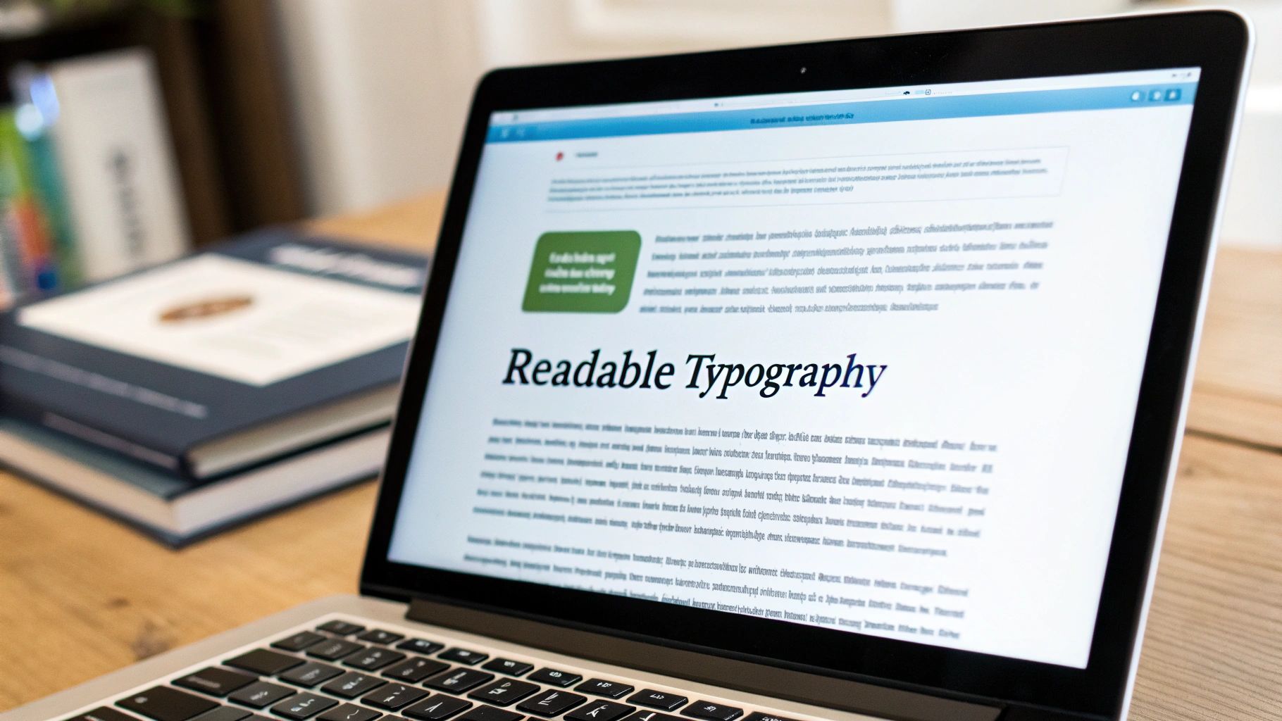
4. Clean and Readable Typography: The Voice of Your Brand
Typography is the art of arranging text to make written language legible, readable, and appealing when displayed. For an aesthetics practice, your choice of fonts, spacing, and text hierarchy is the visual voice of your brand. It communicates professionalism, elegance, and trustworthiness before a potential client reads a single word about your treatments. Good typography guides the user's eye, makes complex information about procedures easy to digest, and creates a serene, uncluttered digital environment that mirrors the calm of your clinic.
Effective typography is a cornerstone of user experience and a critical website design best practice. It ensures that from the moment a visitor lands on your site, they can effortlessly absorb your message, find the information they need, and feel confident in your expertise. A well-structured typographic system prevents user fatigue and frustration, making the journey from browsing services to booking an appointment a seamless and pleasant one.
Why It’s a Top Practice
Beyond aesthetics, clean typography directly impacts usability and accessibility. A clear visual hierarchy tells users what is most important on the page, from headlines to body copy to call-to-action buttons. For potential clients researching sensitive aesthetic treatments, legible text is non-negotiable. It ensures they can understand the benefits, risks, and pricing clearly, which builds the trust necessary to proceed. Sites like Stripe and Medium are excellent examples of how clean, professional typography can define a brand's entire digital presence and enhance credibility.
Actionable Implementation Tips
To implement professional-grade typography on your aesthetics website, focus on these core principles:
Establish a Clear Hierarchy: Use distinct font sizes, weights (e.g., bold, regular), and styles to differentiate between headings (H1, H2, H3), body text, and captions. This guides the user's attention through the content logically.
Prioritise Readability: Aim for an optimal line length of 45-75 characters. For body text, use a generous line height of around 1.5 to 1.6 times the font size to prevent text from feeling cramped.
Limit Your Font Choices: Stick to a maximum of two or three font families for your entire website. A common practice is to use one font for headings (a serif or sans-serif) and another for body text to create a pleasing contrast.
Ensure Sufficient Contrast: Text must be clearly legible against its background. Follow Web Content Accessibility Guidelines (WCAG) and aim for a minimum contrast ratio of 4.5:1 for normal text.
Use an Appropriate Base Font Size: A minimum font size of 16px is the standard for body text on mobile and desktop, ensuring comfortable reading for all users without needing to zoom.
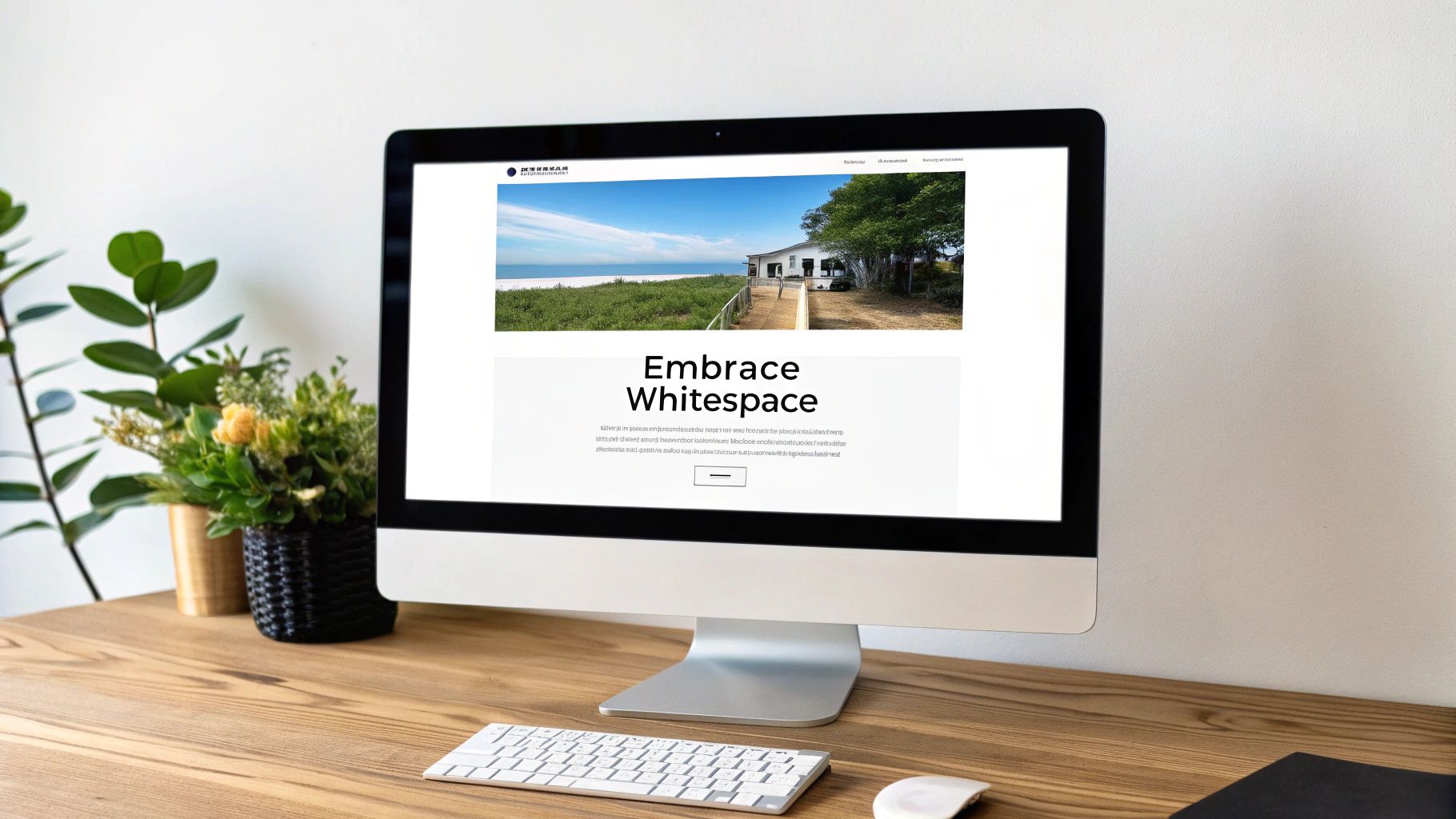
5. Strategic Use of White Space: Creating a Sense of Luxury and Calm
In the aesthetics industry, creating an atmosphere of calm, luxury, and professionalism starts the moment a potential client lands on your website. White space, also known as negative space, is the unmarked area between elements on a page. Far from being "empty," it's an active and powerful design tool that guides the user's eye, reduces cognitive load, and enhances readability. By strategically using white space, you create a sense of sophistication and allow your key messages and stunning visuals to stand out.
This intentional breathing room is crucial for communicating a premium brand identity. A cluttered, busy page can feel overwhelming and cheap, while a spacious, well-organised layout feels high-end and considered. Think of it like a luxury boutique versus a discount store; the presentation directly influences perception of value. For a client seeking a relaxing and precise aesthetic treatment, a clean, uncluttered website design reassures them that they are in professional hands.
Why It’s a Top Practice
Effective use of white space is one of the most important website design best practices because it directly improves the user experience. It increases content legibility by up to 20%, making your treatment descriptions and calls to action easier to read and absorb. This clarity helps users focus on what truly matters: your services, your expertise, and how to book an appointment. A spacious design signals confidence and sophistication, key attributes for any high-end aesthetic clinic.
Actionable Implementation Tips
To master this design principle on your clinic's website, focus on precision and purpose:
Group Related Elements: Use proximity to visually connect related items. For example, keep a treatment description, its price, and its "Book Now" button close together, with ample space separating this group from the next.
Establish Consistent Margins and Padding: Define a baseline spacing unit (e.g., 16px) and use multiples of it throughout your design (e.g., 8px, 16px, 24px, 32px). This creates a harmonious and professional rhythm.
Prioritise Your Call to Action (CTA): Surround your most important buttons, like "Book a Consultation," with generous white space. This makes them a focal point, drawing the user's eye and encouraging them to click.
Increase Line Spacing: For paragraphs of text, set the line height to around 1.5x to 1.8x the font size. This simple adjustment dramatically improves readability, especially for longer treatment descriptions.
Resist Filling Every Gap: The most common mistake is trying to fill every pixel. Embrace the emptiness. Let your high-quality images and compelling headlines breathe, giving them the impact they deserve.
6. Consistent Visual Design and Branding: Building Trust Visually
Imagine walking into a clinic where every room has a different colour scheme, font, and style. It would feel disjointed and unprofessional. Your website is no different. Consistent visual design is the practice of applying your unique brand elements, such as colours, fonts, imagery, and layout patterns, uniformly across every page of your site. This creates a cohesive and predictable experience for your visitors.
For an aesthetic brand, this consistency is paramount. It reinforces your brand identity, making you instantly recognisable and memorable. Whether a client is on your homepage, reading a treatment description, or viewing your gallery, a consistent visual language signals professionalism and attention to detail. This systematic approach, popularised by design pioneers like Paul Rand, builds subconscious trust and improves usability, as users learn to anticipate where to find information and how to interact with your site.
Why It’s a Top Practice
A consistent brand presentation directly impacts how potential clients perceive your clinic’s quality and reliability. When your visual identity is cohesive, it communicates a message of stability and expertise. This is a crucial website design best practice because it transforms your site from a simple collection of pages into a powerful branding tool. It ensures that the premium, trustworthy image you cultivate in your physical clinic is perfectly mirrored online, strengthening brand recall and client confidence.
Actionable Implementation Tips
To effectively implement this website design best practice, focus on creating a unified brand experience:
Develop a Style Guide: Create a core document that outlines your brand’s visual rules. Specify your primary and secondary colour palettes (with hex codes), typography hierarchy (headings, body text), button styles, and rules for spacing.
Establish Imagery Standards: Define the style of photography and videography for your website. Should images be bright and airy, or luxurious and dramatic? Ensuring all visuals share a consistent tone and quality is vital.
Use Design System Tools: For larger projects, leverage tools like Figma or Sketch to create component libraries. This allows you to build pages with pre-defined, consistent elements, ensuring every button and form field adheres to your guidelines.
Conduct Regular Audits: Periodically review every page of your website to check for inconsistencies. Look for rogue fonts, off-brand colours, or outdated design elements that may have slipped through.
Train Your Team: Ensure anyone who creates content for your website, from marketers to bloggers, understands and has access to your brand guidelines to maintain consistency over time.
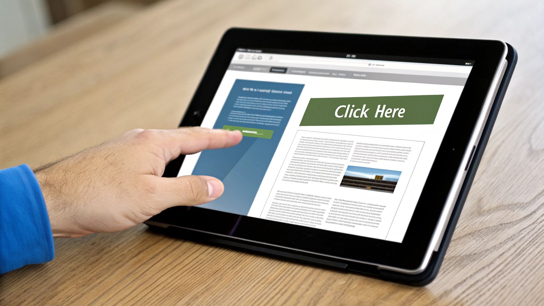
7. Clear and Compelling Call-to-Actions (CTAs): Guiding Clients to Action
Your website can showcase stunning before-and-after photos and detailed service descriptions, but without clear guidance, a potential client might leave without taking the next step. This is where a strong Call-to-Action (CTA) comes in. A CTA is a strategically designed button, link, or prompt that tells the user exactly what to do next, guiding them from passive browsing to active engagement, such as booking a consultation or purchasing a product.
For an aesthetic clinic, effective CTAs are the crucial link between interest and conversion. They transform your website from a simple digital brochure into a powerful client acquisition tool. By using persuasive copy and visually distinct design, you can eliminate decision fatigue and make it effortless for visitors to book an appointment, download a treatment guide, or contact your practice, directly impacting your lead generation and revenue.
Why It’s a Top Practice
A well-crafted CTA is a fundamental element of conversion-focused design and one of the most critical website design best practices. It directly addresses the user’s intent at the precise moment they are most engaged. For instance, a ‘Book Your Free Consultation’ button placed next to a service description for dermal fillers provides an immediate, relevant pathway for a high-intent visitor. This clarity boosts user experience and significantly increases the likelihood of securing valuable leads, making your digital marketing efforts more effective.
Actionable Implementation Tips
To implement powerful CTAs that drive results for your aesthetics business, concentrate on these details:
Use Action-Oriented Verbs: Start your CTA copy with strong, benefit-driven verbs. Instead of a generic ‘Submit’, use compelling phrases like ‘Book My Appointment’, ‘Get My Glow Up’, or ‘Claim My Free Skincare Guide’.
Create Visual Contrast: Your CTA buttons must stand out. Use a bright colour from your brand palette that contrasts sharply with the background but still feels harmonious with your overall design. This visual pop draws the eye instantly.
Strategic Placement: Position your primary CTA ‘above the fold’ so it’s visible without scrolling. Repeat it logically throughout the page, especially after sections that explain the value of a treatment or your clinic’s expertise.
Optimise for Mobile: Ensure your CTA buttons are thumb-friendly on mobile devices, with a minimum tap area of 44x44 pixels. This prevents user frustration and ensures accessibility for your on-the-go clients.
Test and Refine: Don't assume your first attempt is the best. A/B test different copy, colours, shapes, and placements to see what resonates most with your audience and generates the most clicks. For more insights on converting clicks into clients, discover our guide on effective lead generation ads.
8. Accessibility and Inclusive Design: Welcoming Every Client
In the beauty and aesthetics industry, creating a welcoming and inclusive atmosphere is paramount. This philosophy must extend to your digital presence. Accessibility ensures that your website can be used effectively by people of all abilities, including those with visual, auditory, motor, or cognitive impairments. It's about designing for everyone, ensuring that no potential client is excluded from accessing your services or information because of a disability.
By embracing inclusive design principles, you demonstrate that your practice values every individual. This means building a site that functions seamlessly with assistive technologies like screen readers, which read content aloud for visually impaired users, and ensuring it can be navigated without a mouse. This commitment to one of the most crucial website design best practices not only expands your potential client base but also reinforces your brand's reputation as a compassionate and modern practice that cares for all its clients.
Why It’s a Top Practice
Beyond being a legal and ethical imperative in many regions, accessibility has significant business benefits. It improves your site's overall usability and SEO, as search engine crawlers interpret websites similarly to assistive technologies. A well-structured, accessible site is easier for everyone to navigate, leading to better user engagement and lower bounce rates. By making your services available to the 1 in 5 people in the UK who have a disability, you are unlocking a significant market segment and building powerful brand loyalty.
Actionable Implementation Tips
To make your aesthetics website more accessible and inclusive, focus on these technical and content-based actions:
Provide Descriptive Alt Text: For every image, especially those showcasing before-and-after results, provide alternative text () that clearly describes the visual information for users who cannot see it.
Use Correct Heading Structure: Organise your content with a logical heading hierarchy (one H1 per page, followed by H2s, H3s, etc.). This creates a clear outline for screen readers, making navigation much easier.
Ensure Keyboard Accessibility: Test your site to confirm that every interactive element-from the navigation menu to booking forms and treatment accordions-can be accessed and operated using only the Tab, Enter, and arrow keys.
Check Colour Contrast: Use tools to verify that the colour contrast between your text and background meets Web Content Accessibility Guidelines (WCAG) AA standards. This is vital for users with low vision or colour blindness.
Use ARIA Landmarks: For complex interactive components like pop-up booking calendars, use Accessible Rich Internet Applications (ARIA) labels and roles to provide context to assistive technologies about the element's purpose and state.
9. User-Centric Content Strategy: Guiding Your Client's Journey
Beautiful design can capture attention, but it's high-value, user-centric content that converts interest into appointments. A user-centric content strategy involves creating and organising every piece of information on your site, from service descriptions to blog posts, with one person in mind: your potential client. It’s about anticipating their questions, addressing their concerns, and guiding them from "What is a chemical peel?" to "I need to book this treatment."
Instead of simply listing what you offer, this approach focuses on providing genuine solutions and building trust. For an aesthetic clinic, this means creating detailed treatment pages that explain the benefits, process, and aftercare, or writing blog articles that tackle common skincare myths. This strategy positions your brand as a knowledgeable authority, making clients feel confident and informed in their decision to choose you.
Why It’s a Top Practice
A user-centric content strategy is fundamental to modern SEO and is one of the most crucial website design best practices. Search engines like Google are designed to reward websites that best answer a user's query. By creating content that directly addresses the pain points and curiosities of your target audience, you naturally align with search intent, which can significantly boost your rankings and organic traffic. This approach moves beyond keyword stuffing to build a resource hub that establishes credibility and fosters a loyal client base.
Actionable Implementation Tips
To put a user-centric content strategy into practice for your aesthetics website, follow these steps:
Map the Client Journey: Identify the questions clients have at each stage: awareness (e.g., "how to fix uneven skin tone"), consideration (e.g., "microneedling vs. laser"), and decision (e.g., "best clinic for Botox near me"). Create content for each stage.
Answer Questions Directly: Use clear headings and subheadings structured as questions (e.g., "Who is an Ideal Candidate for This Treatment?"). This makes your content highly scannable and optimised for featured snippets and voice search.
Use Analytics for Insights: Dive into your website's analytics to see which pages and blog posts are most popular. Replicate the topics and formats of your top-performing content to create more of what your audience loves.
Create Interconnected Content: Guide users through your site by including relevant internal links. For example, a blog post on "The Benefits of Hyaluronic Acid" should link to your dermal filler service page.
Integrate with Social Media: Your website content provides the perfect foundation for your social channels. For more ideas on how to align these efforts, explore our expert insights into strategic social media management.
Best Practices Comparison of 9 Key Website Design Elements
Aspect | Mobile-First Responsive Design | Intuitive Navigation & Information Architecture | Fast Loading Speed & Performance Optimization | Clean & Readable Typography | Strategic Use of White Space | Consistent Visual Design & Branding | Clear & Compelling Call-to-Actions (CTAs) | Accessibility & Inclusive Design | User-Centric Content Strategy |
|---|---|---|---|---|---|---|---|---|---|
Implementation Complexity 🔄 | Medium to High: Requires upfront planning and expertise | Medium: Requires thoughtful site structure and ongoing updates | High: Needs technical skills and continuous monitoring | Medium: Managing fonts and responsiveness can be complex | Medium: Careful balance needed to avoid clutter or emptiness | Medium: Style guide creation and enforcement required | Medium: Needs design and copy coordination with testing | High: Involves legal standards and assistive tech testing | Medium to High: Requires content planning and maintenance |
Resource Requirements ⚡ | Moderate: Design tools and mobile device testing needed | Moderate: User testing tools and IA techniques | High: Optimization tools, CDNs, and developer expertise | Low to Moderate: Font licensing and testing | Low: Design time focused on spacing | Moderate: Design systems and documentation tools | Moderate: Copywriting and design resources | Moderate to High: Accessibility tools and expertise | Moderate: Content creators, SEO tools, and analytics |
Expected Outcomes 📊 | ⭐⭐⭐⭐⭐ Improved UX across devices, better SEO | ⭐⭐⭐⭐ Enhanced findability, reduced bounce rates | ⭐⭐⭐⭐⭐ Faster load times, better rankings, improved conversions | ⭐⭐⭐⭐ Better readability, accessibility, and brand consistency | ⭐⭐⭐⭐ Increased focus, reduced clutter, professional look | ⭐⭐⭐⭐ Strong brand identity and user trust | ⭐⭐⭐⭐ Increased conversions and user guidance | ⭐⭐⭐⭐⭐ Equal access, legal compliance, brand reputation | ⭐⭐⭐⭐ Higher engagement and SEO performance |
Ideal Use Cases 💡 | Mobile-first sites, new projects needing cross-device support | Complex websites, e-commerce, content-heavy sites | Sites with performance focus, high traffic, mobile users | Content-rich sites, blogs, news portals | Minimalist design, premium brands, mobile-friendly layouts | Brand-driven sites, large-scale projects, multi-page websites | Conversion-focused pages, landing pages | Public service sites, legal compliance, inclusive brands | Content-heavy sites, marketing, user education |
Key Advantages ⭐ | Future-proof, SEO friendly, prioritizes essentials | Logical user journeys, lowers user frustration | Improved UX and SEO, cost savings | Enhances comprehension, reduces eye strain | Boosts clarity and user focus, premium feel | Builds trust, consistency, reduces dev time | Clear prompts increase goal completions | Enlarges user base, legal safeguards, better usability | Aligns content with user goals, boosts authority |
Bringing It All Together: Your Blueprint for Digital Excellence
Navigating the landscape of website design best practices can feel like mastering a new art form, but as we've explored, the principles are rooted in one core idea: creating a digital experience that mirrors the quality, care, and professionalism of your real-world services. Your website is no longer just a digital brochure; it's a dynamic, interactive extension of your clinic, salon, or brand. It’s your hardest-working employee, available 24/7 to welcome potential clients, answer their questions, and guide them towards booking a treatment.
Implementing these practices isn't about simply following a checklist. It's about adopting a strategic, client-centric philosophy. Each element we've discussed works in harmony to build a cohesive and persuasive user journey. A mobile-first approach ensures you meet clients where they are, while intuitive navigation and lightning-fast loading speeds respect their time and eliminate frustration. This seamless foundation sets the stage for your brand to shine.
From Principles to Profit: The Tangible Impact
The true power of excellent web design lies in its ability to translate abstract concepts into tangible business results. Think of it as a pyramid of trust and conversion:
The Foundation: This is built with technical excellence. Fast performance, responsive design, and robust accessibility create a stable, welcoming environment for everyone. Without this, even the most beautiful design will fail.
The Structure: Clear navigation, logical information architecture, and readable typography form the structure. This is how you guide users, making their journey effortless and logical, preventing them from getting lost or overwhelmed.
The Aesthetics: Strategic use of white space, consistent branding, and high-quality imagery represent the visual appeal. This is what creates the emotional connection, reflects your brand's unique flavour, and makes a memorable first impression.
The Action: Compelling calls-to-action and a user-centric content strategy are the final, crucial steps. This is where you convert interest into action, transforming a passive browser into a new client booking an appointment.
By meticulously implementing these website design best practices, you’re not just making your site look better; you’re building a powerful conversion machine. You are proactively removing friction, building credibility, and demonstrating your commitment to client satisfaction before they even step through your door. It’s a direct reflection of your professional standards.
Your Actionable Path Forward
The journey to digital excellence is continuous. Your website, like your business, should evolve. Start by auditing your current site against the nine pillars we've covered. Identify the one or two areas that need the most immediate attention. Perhaps it’s optimising your image sizes to boost speed or rewriting your CTAs to be more direct and compelling.
Don't feel you need to overhaul everything overnight. Small, incremental improvements can have a significant cumulative effect. The key is to begin. By prioritising a strategic, user-focused approach to your online presence, you are investing directly in the growth and reputation of your aesthetic business, ensuring your digital front door is as polished and professional as the services you provide within.
Crafting a website that masters all these elements requires specialised expertise, especially in the competitive aesthetics industry. If you're ready to transform your online presence into a powerful client-acquisition tool, the team at Aesthetic Socials can help. We specialise in implementing these very website design best practices to create stunning, high-performance websites for beauty and aesthetic professionals like you. Visit Aesthetic Socials to learn how we can build your blueprint for digital success.
Article created using [Outrank](https://outrank.so)


Comments